Last week, I was chatting with my neighbor Sarah about her latest crochet adventure. She’d been working on a gorgeous granny square blanket for months, but something was bothering her. “The colors just don’t pop the way I want them to,” she said, holding up her work. “I feel like I’m missing something important about how to make my projects really shine.”
Sarah’s frustration hit home because I’ve been there too. You can follow a pattern perfectly, use the recommended yarn, and still end up with something that looks… well, just okay. The difference between a project that looks handmade in the best way versus one that screams “beginner” often comes down to understanding crochet color theory.
Here’s what I’ve learned after years of making color mistakes (and some happy accidents): color theory isn’t just for painters or graphic designers. It’s one of the most powerful tools we have as crocheters to transform our work from good to absolutely stunning. Whether you’re planning a baby blanket, designing your own granny square patterns, or just trying to use up your stash in a way that actually looks intentional, understanding how colors work together will change everything.
The best part? You don’t need an art degree to get this right. I’m going to walk you through the practical stuff that actually matters for crochet projects, skip the overwhelming theory, and give you the tools to make confident color choices every single time.
Quick Answer
Crochet color theory uses the color wheel to create harmonious combinations through complementary (opposite), analogous (neighboring), or triadic (evenly spaced) color schemes. Understanding warm vs. cool colors, value contrast, and the 60-30-10 rule will instantly improve your project outcomes.
Understanding the Color Wheel for Crochet
Let me start with something that might surprise you: you probably already know more about color theory than you think. Every time you’ve looked at a project and thought “those colors just work together,” you were responding to color relationships that follow predictable patterns.
The color wheel is basically a map of how colors relate to each other. Think of it as your GPS for color decisions. The Craft Yarn Council recognizes three types of colors: primary (red, blue, yellow), secondary (green, orange, purple), and tertiary (the colors in between, like blue-green or red-orange).
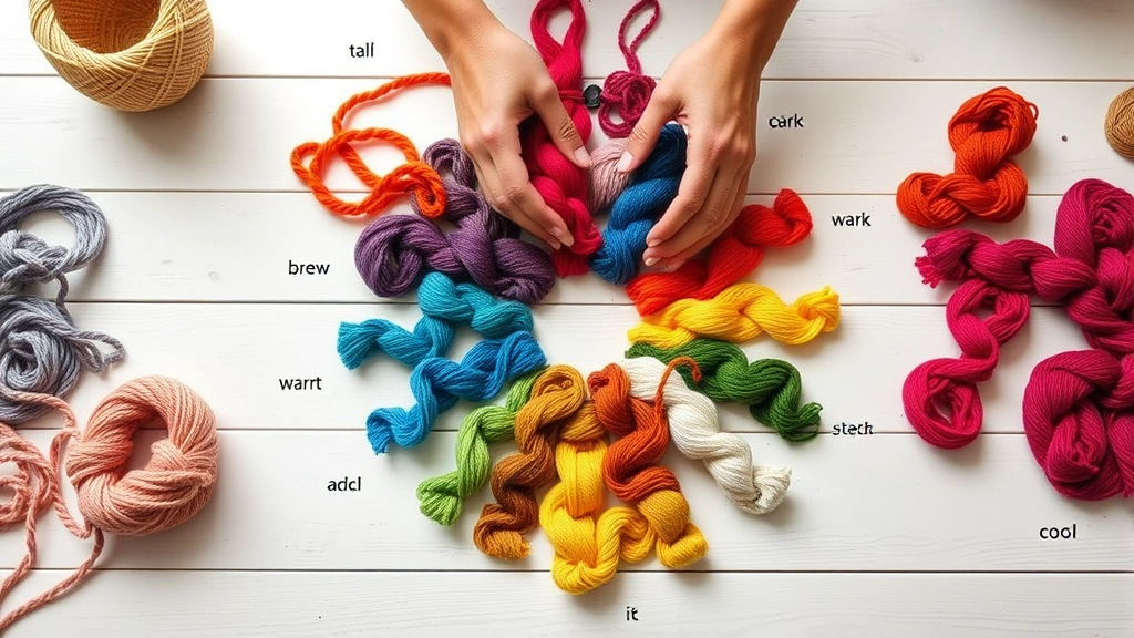
Here’s where it gets practical for crochet: yarn manufacturers don’t always follow traditional color naming. That “sage” might actually be a yellow-green, while “dusty rose” could lean more purple-pink than true pink. I always hold yarns up to natural light and ask myself where they’d sit on the color wheel, regardless of what the label says.
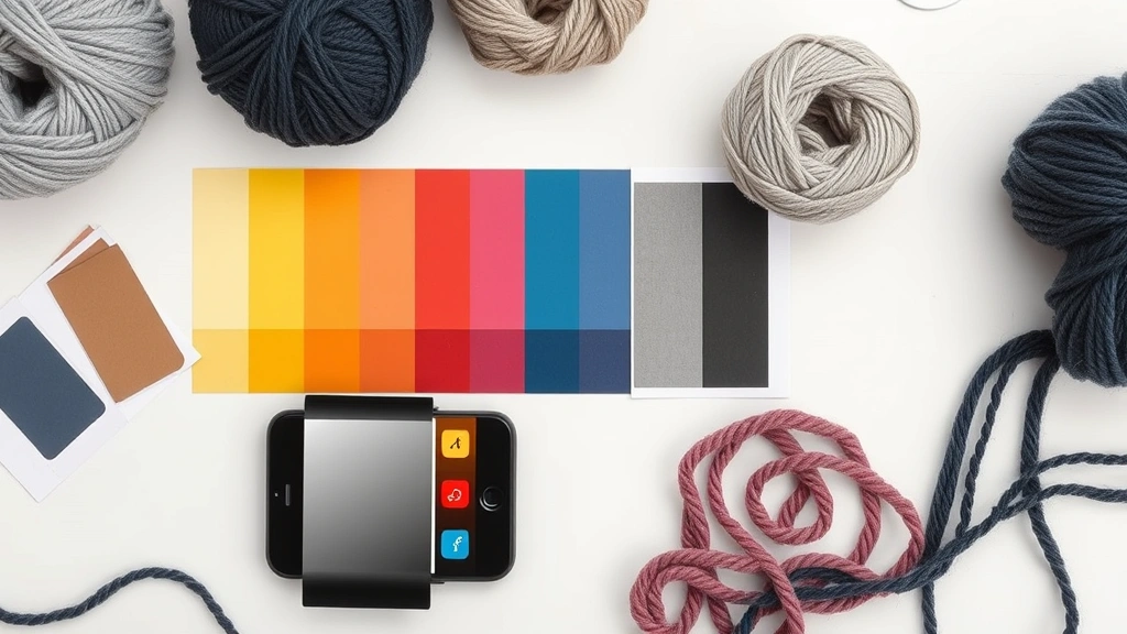
Pro tip: Take a photo of your yarn combinations on your phone and switch it to black and white. This instantly shows you the value relationships without color distracting you.
When I’m planning a project, I actually sketch out a simple color wheel and mark where my chosen colors fall. It sounds nerdy, but it’s saved me from so many “what was I thinking?” moments. Red Heart Super Saver in Cherry Red and Paddy Green might sound festive, but they’re directly opposite on the color wheel – which can be stunning for Christmas projects but overwhelming for everyday items.
The key is understanding that colors have relationships, just like people. Some play well together naturally, others need a mediator (hello, neutral colors), and some should probably just avoid each other entirely unless you’re going for maximum drama.
Essential Color Schemes That Actually Work
Okay, let’s talk about the color combinations that consistently work for crochet projects. I’ve tested these extensively in my own work, and they’re practically foolproof once you understand the basic principles.
Complementary Colors: The Drama Queens
Complementary colors sit directly opposite each other on the color wheel. Think red and green, blue and orange, yellow and purple. These combinations have maximum contrast and really pop, but they can be overwhelming if you use them in equal amounts.
I love using complementary schemes for crochet afghans where I want visual impact. A navy blue background with burnt orange accents in a geometric pattern? Stunning. The trick is using the 60-30-10 rule: 60% dominant color, 30% secondary color, 10% accent.
Analogous Colors: The Harmonizers
These are colors that sit next to each other on the color wheel, like blue, blue-green, and green. Analogous schemes create harmony and are incredibly soothing to look at. They’re perfect for baby items, meditation shawls, or any project where you want a calming effect.
I recently made a throw using Lion Brand Wool-Ease in different shades of blue and green – from deep teal to soft sage. The gradient effect was gorgeous, and because the colors were naturally related, I couldn’t really go wrong with the proportions.
Triadic Colors: The Balanced Approach
Triadic schemes use three colors evenly spaced around the color wheel. The classic example is red, yellow, and blue – primary colors that create vibrant but balanced combinations. For crochet, I often soften these by choosing muted versions rather than pure, bright colors.
| Color Scheme | Best For | Example Yarns |
|---|---|---|
| Complementary | Statement pieces, holiday items | Navy + Orange, Purple + Yellow |
| Analogous | Baby items, relaxing projects | Blue-Green-Purple, Red-Orange-Yellow |
| Triadic | Playful blankets, kids’ items | Soft Red-Blue-Yellow |
The beauty of understanding these schemes is that you can walk into any yarn store and quickly identify combinations that will work. No more standing there for twenty minutes trying to decide if colors “go together” – you’ll know.
Warm vs. Cool Colors in Yarn Selection
This might be the most immediately useful concept for everyday crochet projects. Warm colors (reds, oranges, yellows) advance toward you and feel cozy and energetic. Cool colors (blues, greens, purples) recede and feel calming and spacious.
Understanding this changes how you approach different types of projects. For a crochet baby blanket, cool colors like soft blues and lavenders create that peaceful, sleepy feeling parents want. But for a throw that needs to warm up a large living room, warm colors like rust, gold, and deep red will make the space feel more intimate.
Here’s something I learned the hard way: the temperature of your colors affects how yarn weight appears. Cool colors in bulky yarn can look heavy and overwhelming, while warm colors in the same weight feel substantial but cozy. I once made a chunky cowl in a cool gray-blue, and it looked like a neck brace. The same pattern in a warm camel color? Perfect.
Yarn stores often organize colors by temperature without realizing it. Notice how the “cozy” section tends to be warm colors, while the “fresh” or “modern” sections lean cool? Use this to your advantage when planning projects for specific seasons or moods.
I keep a mental note of which colors in my stash are warm versus cool. This helps when I’m trying to use up odds and ends – I can create cohesive projects by sticking to one temperature family, even if the actual colors are quite different.
Why Value and Contrast Matter More Than You Think
Value is probably the most overlooked aspect of color theory in crochet, but it’s often the difference between a project that looks professional and one that looks muddy. Value refers to how light or dark a color is, completely separate from the actual hue.
I learned this lesson while working on a complex crochet stitch pattern that was supposed to create a beautiful textured design. I used three different colors that looked great together in the skein, but when crocheted up, the pattern completely disappeared. The problem? All three colors had the same value – they were all medium-toned, so there was no contrast to define the pattern.
Here’s a simple test: take a photo of your yarn combination and convert it to grayscale on your phone. If you can’t clearly distinguish between the colors in the black and white version, you need more value contrast. This is especially critical for projects where stitch definition matters, like cables, textured stitches, or colorwork patterns.
Creating Effective Contrast
For most crochet projects, you want at least three different values: light, medium, and dark. This doesn’t mean you need three different colors – you can achieve this with different shades of the same color family.
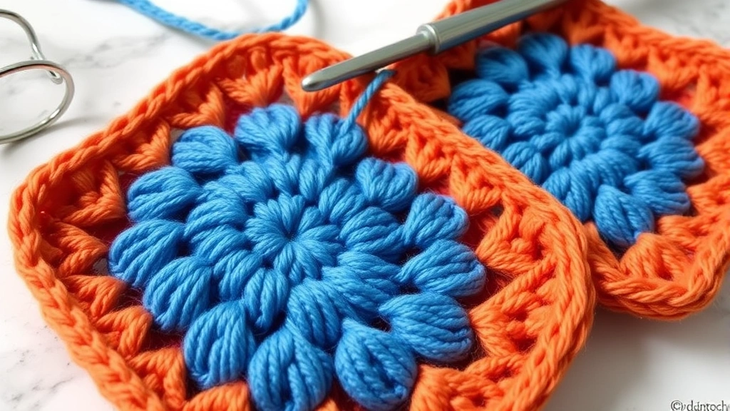
Think about a classic granny square in shades of blue: light sky blue, medium denim blue, and dark navy. The color harmony is perfect because they’re all blues, but the value contrast makes each round clearly defined and visually interesting.
Quick contrast check: Hold your yarns at arm’s length and squint. If they blur together, you need more value difference.
When working with variegated or self-striping yarns, pay attention to the value range within the yarn itself. A yarn that goes from very light to very dark will create natural contrast, but one that stays within a narrow value range might need a solid companion in a contrasting value to really shine.
Applying Color Theory to Real Crochet Projects
Let’s get into the nitty-gritty of how this actually works in practice. I’m going to walk you through my process for different types of projects, because knowing the theory is one thing – applying it to real yarn and real patterns is where the magic happens.
Planning a Multi-Color Afghan
For large projects like afghans, I start with what I call the “anchor color” – usually a neutral or the color I have the most of. Then I choose 2-3 additional colors using one of the schemes we discussed. For a recent throw, I started with a warm gray as my anchor, then added dusty rose (analogous warm) and deep teal (complementary cool accent).
The proportions matter hugely here. I used the gray for about 50% of the project, dusty rose for 35%, and teal for just 15% as accent borders and corner details. This created visual interest without chaos.
Choosing Colors for Wearables
When making crochet sweaters or accessories, I consider skin tone and personal style alongside color theory. Cool-toned people generally look amazing in cool colors, but a warm accent can add life to their complexion. Warm-toned people shine in warm colors, but cool accents can be sophisticated.
For a recent cardigan, I chose a cool sage green as the main color (perfect for the recipient’s cool skin tone) but added warm gold buttons and a subtle warm gold stripe detail. The color theory made it harmonious, but the slight temperature mix made it more interesting and flattering.
Using Up Stash Yarn
This is where color theory really proves its worth. Instead of trying to use every color you have, group your stash by color families and temperature. You’ll discover combinations you never considered before.
I once had random amounts of yarn in purple, blue-purple, and blue – perfect analogous colors I’d never thought to combine. Adding a neutral cream as a joining color, I created a stunning throw that looked completely intentional rather than like a stash-busting project.
- Assess Your Palette
Lay out all your chosen colors in natural light. Take a photo and check the grayscale version for value contrast.
- Determine Proportions
Decide which color will dominate (usually 50-60%), which will support (25-35%), and which will accent (10-15%).
- Test Your Combination
Crochet a small swatch or granny square using your proportions. Live with it for a day or two before committing to the full project.
- Adjust as Needed
If something feels off, usually it’s the proportions rather than the color choices. Try shifting the balance before changing colors entirely.
Common Color Mistakes and How to Fix Them
I’ve made pretty much every color mistake possible, so let me save you some frogging time by sharing the most common issues I see (and have created myself).
The “Too Many Colors” Trap
More colors don’t automatically make a project more interesting. I once started a blanket with eight different colors because I loved them all individually. The result looked like a rainbow threw up. Now I stick to a maximum of four colors for most projects, including neutrals.
If you’re already committed to a multi-color project that’s looking chaotic, try adding a consistent neutral border or joining color. White, cream, or gray can unify almost any color combination and give the eye a place to rest.
Ignoring Undertones
This is especially tricky with neutrals. That “white” might have pink undertones, while your “cream” leans yellow. When combined, they’ll look dirty rather than intentional. Always compare neutrals side by side in natural light.
I learned this lesson making crochet doilies where I assumed all “white” threads were the same. The finished piece looked sloppy because some sections appeared dingy next to the pure white sections.
Matching Too Perfectly
Surprisingly, colors that match exactly can look flat and boring. A little variation within your color family creates more visual interest. Instead of using the exact same blue throughout a project, try two or three blues that are close but not identical.
Forgetting About Lighting
Colors look completely different under various lighting conditions. That gorgeous purple that looked perfect in the store might appear brown under your living room lamps. Always check your color combinations in the lighting where the finished project will live.
For gifts, I try to see colors in both natural daylight and typical indoor lighting. LED bulbs can shift colors dramatically, making cool colors look harsh and warm colors look muddy.
How Yarn Fiber and Texture Affect Color
Here’s something they don’t teach you in basic color theory: the same color can look completely different depending on the yarn fiber and texture. This is crucial information for crocheters because we’re not just working with flat color – we’re working with textured, three-dimensional materials.
Shiny fibers like silk or mercerized cotton reflect light and make colors appear brighter and more saturated. The same blue in a matte wool will look deeper and richer, while in a shiny cotton it might appear electric. I learned this when substituting Lion Brand 24/7 Cotton for wool in a pattern – the colors were technically the same, but the finished project looked completely different.
Texture and Color Perception
Highly textured stitches break up color differently than smooth stitches. A complex cable pattern in a variegated yarn might look busy and confusing, while the same yarn in simple single crochet could be stunning. Conversely, a solid color that looks boring in basic stitches might be perfect for showing off intricate texture work.
When I’m planning projects with advanced crochet stitches, I actually choose slightly higher contrast colors than I would for simpler patterns, because the texture will soften the contrast naturally.
Fiber Content Considerations
Acrylic yarns tend to hold color differently than natural fibers. They can appear more saturated and sometimes have a slight sheen that affects color relationships. Natural fibers like wool absorb light and create softer color transitions.
For projects where color accuracy is critical, I always buy an extra skein to test. Dye lots can vary significantly, and some fibers take dye differently even within the same brand and color name.
Remember: Color theory guides your choices, but your specific materials might require adjustments. Trust your eyes and test when possible.
This is especially important when working with hand-dyed or indie-dyed yarns from places like Ravelry shops. These gorgeous yarns often have subtle color variations that can either enhance or complicate your planned color scheme.
Common Questions
How many colors should I use in one crochet project?
For most projects, 2-4 colors work best, including any neutrals. More than four colors can look chaotic unless you’re specifically going for a scrappy or rainbow effect. The key is using colors in unequal proportions – avoid the temptation to use equal amounts of each color.
Can I mix warm and cool colors in the same project?
Absolutely! The trick is to let one temperature dominate and use the other as an accent. A cool blue blanket with warm orange edging can be stunning, but a 50-50 mix of warm and cool often looks confused. Aim for about 70-80% one temperature, 20-30% the other.
What’s the best way to test color combinations before starting a big project?
Crochet a small granny square or swatch using your planned proportions. Live with it for a few days in different lighting conditions. Take photos in both color and grayscale to check value contrast. If you’re still happy after a week, go for it.
How do I choose colors that work well with variegated yarn?
Look at all the colors in your variegated yarn and choose solids that appear in it, but in different values. If your variegated yarn has light blue, medium green, and dark purple, choose one of those colors in a different shade or add a neutral. Avoid competing with busy variegated yarn by keeping other colors simple.
Why do my color combinations look different than the pattern photos?
Photography, lighting, and screen settings all affect how colors appear. Pattern photos are often edited for contrast and saturation. More importantly, different yarn brands and dye lots will never match exactly. Use the pattern photo as inspiration but trust your own color choices for your specific materials.
Should I consider the room where my project will be used when choosing colors?
Definitely! A throw that looks perfect in your bright craft room might disappear on a beige couch in a dimly lit living room. Consider both the existing color scheme and the lighting in the space. Cool colors can make small rooms feel larger, while warm colors make large spaces feel cozier.
How do I fix a project where the colors aren’t working together?
Often the issue is proportion rather than color choice. Try adding a unifying border in a neutral color, or incorporate more of your least-used color to balance the proportions. If that doesn’t work, consider adding a consistent accent color throughout the project to tie everything together.
What colors work best for baby items?
Soft, muted colors in analogous schemes work beautifully for babies. Think pale yellow with soft peach, or light blue with lavender. Avoid high contrast combinations that might be overstimulating. Pastels and neutrals photograph beautifully and work for any gender.
Understanding color theory has honestly transformed my crochet practice. What used to be guesswork and happy accidents is now intentional and confident. You don’t need to become a color expert overnight, but having these basic principles in your back pocket will make every project more successful.
Start small – try one new color concept on your next project. Maybe experiment with value contrast in a simple granny square, or test an analogous color scheme for a scarf. Pay attention to what works and what doesn’t, and don’t be afraid to trust your instincts alongside the theory.
The most beautiful crochet projects aren’t necessarily the most complex ones – they’re the ones where every element, including color, works together harmoniously. With these tools, you’re well on your way to creating pieces that make people stop and ask, “Did you really make that yourself?” And trust me, that never gets old.